Vigo Money
landing page UX and copy refresh
Role: UX Writer / Content Designer
Scope: Messaging hierarchy, UX copy, CTA clarity, onboarding flow
TLDR:
Before & After highlights:
I replaced the generic hero text with a more user-focused, benefit-driven headline:
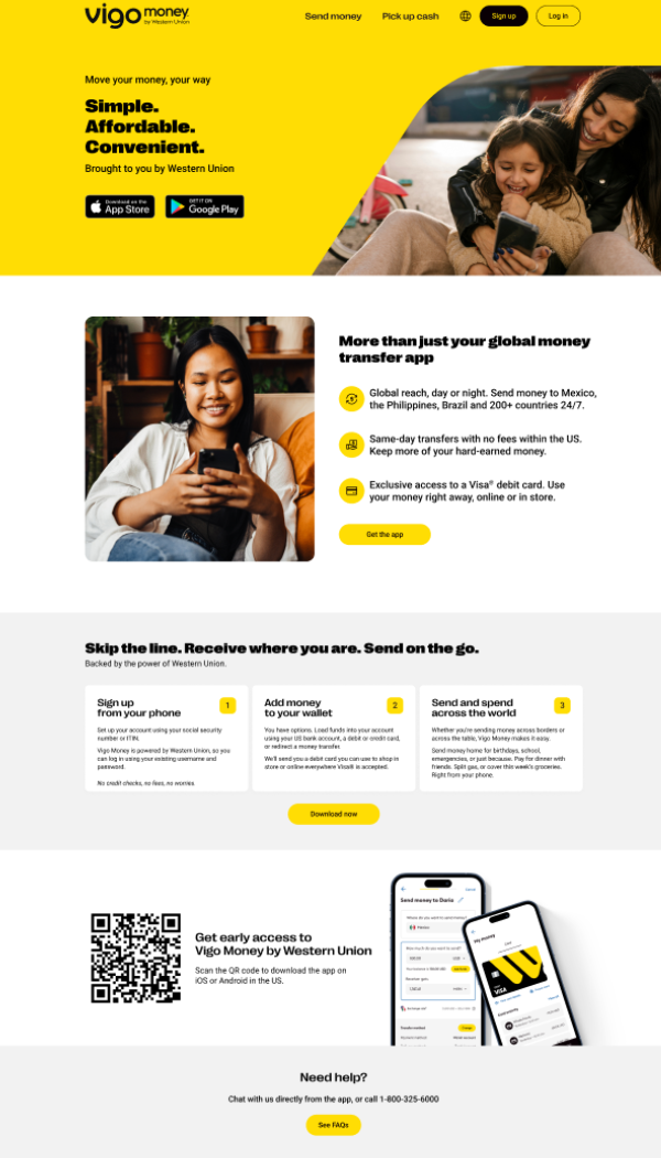
“More than just your global money transfer app” → “Move your money, your way.”Streamlined CTAs for consistency and clearer user flow (example: unified "Get the app" button)
Simplified onboarding section with intuitive, action-oriented step titles
Reorganized content for better readability and visual hierarchy
Enhanced clarity and trust with concise value props and brand reinforcement
Result: A clearer, more engaging landing experience designed to drive app downloads and build user trust.
before

after
if you want the full explanation…
A more impactful hero message
Before:
Headline: “More than just your global money transfer app”
Subhead: “Powered by Western Union”
After:
Headline: “Move your money, your way”
Subhead: “Simple. Affordable. Convenient.”
Why this is better:
More user-centric and benefit-focused
Bolder, punchier copy using a rhythmic 3-word structure that improves recall
Better emotional appeal through “your way” creates a feeling of empowerment
Button hierarchy and placement
Before: Repeated “Get the app” button in different styles
After: Streamlined CTAs with consistent yellow “Get the app” and App Store buttons prominently above the fold
Why this is better:
Improved visual consistency
Clear and immediate action step
Reduces friction in the user journey
Headline and copy reorganization
Before:
Left side: photo
Right side: “Simple, affordable, convenient. Powered by a brand you trust.” + bullet points
After:
I moved this content below the fold, allowing the hero area to shine
Messaging like “Simple. Affordable. Convenient.” is now used as a top-line pitch, enhancing visibility
Why this is better:
Prevents content overload at the top
Gives each message its own space for better readability
Allows the hero area to be laser-focused on CTA and key value prop
“Get Started" Section: Clearer flow and labeling
Before:
Header: “Skip the line. Receive where you are. Send on the go.”
Supporting subhead felt a bit marketing-heavy
After:
I updated the header to: “Get started”
Simpler, action-oriented language
Each step renamed more intuitively:
“Sign up with just your phone”
“Add money to your wallet”
“Send and spend across the world”
Why this is better:
Easier to follow
More relatable, less buzzword-heavy
Emphasizes ease of use and real-world actions
Cleaned up Support and QR code sections
Before:
“Download now” button was below the three-step section, QR section felt visually crowded
After:
Button label aligned to “Get the app”
Overall layout spacing improved
Support section remains minimal but clear
Why this is better:
Improves visual hierarchy
Less cluttered = better focus
Matches call-to-action across the page
Typography and visual layout
Before:
Some text blocks were dense, with less white space
After:
More white space and breathing room between sections
Font weights and sizes used more effectively for scannability