Case study:
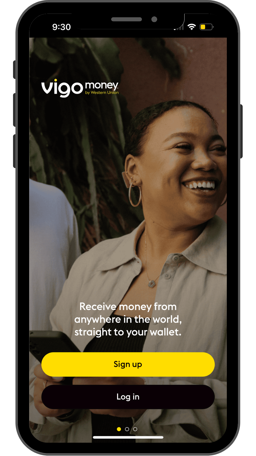
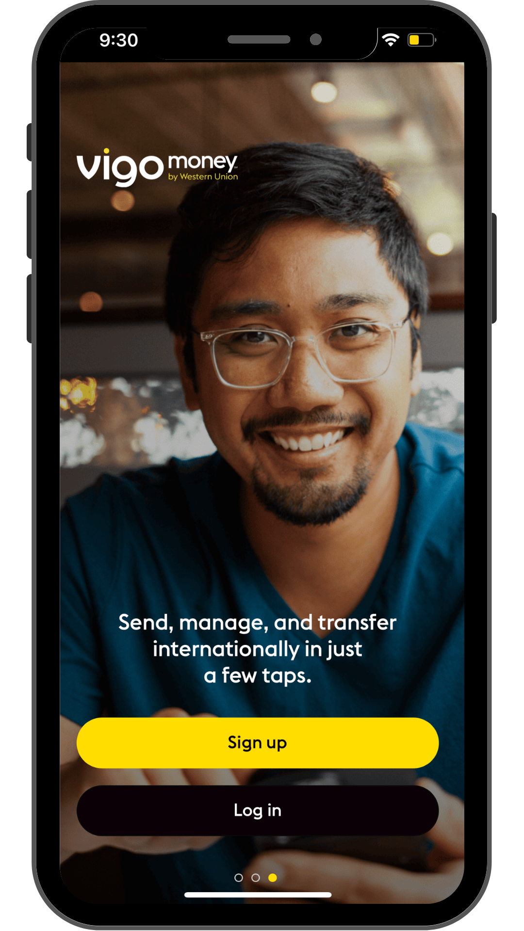
mobile app welcome screen

Project snapshot
Vigo Money helps users move money easily and build better financial habits. The goal was to craft welcome and onboarding microcopy to make the app feel clear, trustworthy, and motivating from the very first screen. The copy empowers users to feel in control of their finances from the very first tap. The messaging needed to be as helpful and thoughtful as the tech behind it.
The product
Vigo Money, an app designed to send, receive, and manage money.
My approach
Took the product’s value proposition to write and refine UX copy for welcome and onboarding screens
Simplified complex financial concepts for first-time users
Collaborated with design and product to ensure cohesive, user-first language
UX highlights
Clarity - immediate, jargon-free value proposition
Tone - friendly and empowering copy to instill trust
Call to action - direct CTAs guide users smoothly through setup
User guidance - step-by-step messaging that reduces cognitive load and builds confidence
The final experience
Delivered a friendlier, more intuitive first-time flow
Helped reduce friction and user hesitation with supportive microcopy
Built stronger user connection through human-centered copy